
Color Pairing 101: Matching Hermès Neutrals with Everyday Wardrobes
Check out our Hermès collection and Birkin bags!
Matching Hermès neutrals with your everyday wardrobe isn't just about luxury, it's about crafting a style that feels intentional and elevates what you already own.
Hermès neutral colors like Noir, Gold, Étoupe, and Étain work as sophisticated anchors, complementing everything from jeans to business suits with almost eerie ease. These shades feel timeless, shrugging off trends and quietly outlasting most other pieces in your closet.
We've all stood in front of our closets, Hermès bag in hand, second-guessing if it really works with what we're wearing. But here's the thing: Hermès has nailed the art of neutrals that just... go with almost anything.
Whether you're reaching for a Kelly in Craie or a Birkin in Étoupe, these shades are meant to enhance your personal style, not fight with it.
The trick is learning how these luxury neutrals play with the rest of your wardrobe. From picking up on undertones to balancing colors, let's get into how you can actually make your Hermès investment blend seamlessly with everything from your coziest sweater to your sharpest blazer.
Key Takeaways
- Hermès neutral colors are versatile anchors, making both casual and formal outfits look put-together
- Knowing color undertones helps you pair Hermès bags with what you already own for a more cohesive look
- Smart color pairing with Hermès neutrals stretches your investment and opens up endless styling options
Understanding Hermès Neutrals and Their Signature Appeal
Hermès neutral colors are the backbone of luxury styling, offering up classic hues that never really go out of style. These shades are more than just basics, they're staples that carry a sense of quiet confidence and, honestly, a bit of magic.
What Defines a Hermès Neutral
A Hermès neutral isn't just any beige or grey. These colors have depth and complexity, they're subtle, but somehow always feel elevated.
The house's take on neutrals is all about versatility and timelessness. These shades slide right into both casual and formal looks. They don't overpower your outfit; they make it better.
Hermès neutrals span warm tones like Gold and Étoupe, cool shades such as Étain and Craie, and the ever-classic Noir. Each one is developed with intention, so even the simplest neutral feels special.
What sets them apart is Hermès' obsession with color. With over 250 shades created over the years, their expertise shows, these neutrals just look and feel different.
Popular Hermès Neutral Tones and Their Origins
Noir is the ultimate chameleon. Pure black, endlessly versatile, and it's been around since Hermès began.
Gold brings warmth and a touch of richness. It's honey-toned, never flashy, and plays nicely with earth tones and jewel colors alike.
Étoupe is a modern must-have. This taupe-grey is balanced, warm and cool at once. It fits right in, whether you're going casual or dressing up.
Étain offers a cooler, almost metallic grey. It feels contemporary and bridges silver and grey in a way that's pretty unique.
Craie is soft and chalky, almost white but not stark. It's subtle, and yes, it takes a little confidence to wear, but the payoff is huge in versatility.
The Role of Neutrals in the Hermès Color Palette
Neutrals are the foundation of Hermès' color story. They show the brand's commitment to lasting style over flash-in-the-pan trends.
These colors anchor a collection. While seasonal shades come and go, neutrals stick around, year after year. They're the ones you keep reaching for.
For every bold Orange or Rose Lipstick, Hermès offers a neutral to keep the palette grounded. This balance makes their collections feel complete.
And let's not ignore the investment angle, neutrals like Noir and Gold tend to hold their value better than the wild-card shades. If you care about resale, it's something to keep in mind.
The Fundamentals of Color Pairing: Essentials for a Luxury Wardrobe
Getting color theory down changes how you approach fashion. Instead of guessing, you start building outfits that actually flatter you and feel intentional. The basics? The color wheel, undertones, and a bit of color psychology.
The Color Wheel and Neutrals
The color wheel is your map for putting together outfits that just work. Primary colors (red, blue, yellow) are the base, secondary (orange, green, purple) come from mixing those.
For luxury wardrobes, analogous colors, the ones next to each other on the wheel, feel harmonious. Think sage green with soft blue, or camel with cognac.
Complementary colors are opposites and make things pop. A navy Hermès blazer with a terracotta blouse? Chef’s kiss.
Neutrals are a different beast. True neutrals: black, white, grey, beige. But luxury neutrals have undertones, champagne is warm, dove grey is cool.
The magic happens when you get those undertones. Warm neutrals (camel, cream) look beautiful together. Cool ones (charcoal, pearl grey) make for sleek, monochrome looks.
Chroma, Undertone, and Skin Tone Basics
Chroma is about how intense a color is. High-chroma is bold, low-chroma is muted and, frankly, easier to wear every day.
Luxury wardrobes usually lean low-chroma. A muted sage coat is more versatile than a neon green one.
Undertones matter in every color, even neutrals. Beige can be pink, yellow, or grey-based. Spotting these differences helps avoid awkward clashes.
Skin undertones fall into warm, cool, or neutral. The classic test: hold white paper to your face in daylight. Does your skin look golden or rosy? That’s your clue.
Cool undertones look best in blue-based colors, navy, charcoal, icy grey. Warm undertones shine in gold-based shades like camel and chocolate brown.
Color Psychology in Outfit Styling
Colors speak before we do. Navy says authority and trust, ideal for big meetings.
Warm neutrals like camel and cream feel approachable and quietly confident. Perfect for when you want to look polished but not intimidating.
Black is power, but it depends on the piece. Soft black cashmere feels luxe, while a sharp black blazer is all business.
Grey is the middle ground, light grey is gentle, charcoal is strong but less severe than black.
Knowing this, you can dress for how you want to feel, or how you want people to see you. Sometimes your favourite taupe is just the right mix of creative and professional.
Building Your Wardrobe Color Palette: Hermès Edition
Putting together a wardrobe palette with Hermès neutrals takes a little strategy. The idea is to pick timeless shades that play nicely together and flatter your coloring.
Selecting Your Core Neutrals
Pick three or four neutrals to be your wardrobe backbone. Hermès classics: Étoupe (taupe-grey), Noir (black), Craie (off-white), Étain (pewter grey).
Lay your pieces out in daylight to see how they mesh.
Work with what you own. Got an Étoupe Birkin? Build around that. If you have a Black Kelly, let Noir lead and add lighter accents.
Aim for 70-80% neutrals in your closet. It sounds like a lot, but it keeps things easy and elegant.
Consider your lifestyle. If you work in a formal office, you might want deeper neutrals like Graphite. Creative fields? Softer shades like Gris Perle or Biscuit could be more fun.
Dark Neutrals vs. Light Neutrals
Dark neutrals - Noir, Graphite, Deep Blue - bring drama and polish. They're great for evenings, meetings, or anytime you want to feel a bit more powerful.
They pair well with metallics and really make lighter accessories pop.
Light neutrals - Craie, Biscuit, Gris Perle - feel fresh and versatile. Perfect for daytime, casual luxury, or warmer months.
Sure, they need a bit more care, but the effortless vibe is worth it.
Mix both in your wardrobe. Maybe you lean 60% dark, 40% light, or flip it if that's more your style.
Think about your climate, too. Hotter places suit lighter palettes; colder regions feel right with richer, deeper shades.
Seasonal Color Analysis for Personal Style
Your skin’s undertone guides which Hermès neutrals will flatter you most. Cool undertones? Go for Étain, Gris Perle, Noir. Warm undertones? Étoupe, Gold, Biscuit are your friends.
Spring and Summer types gravitate to lighter, clearer neutrals, Craie, soft grey cashmere, crisp white.
Autumn and Winter types look great in deeper, richer neutrals, Étoupe with chocolate brown, Noir with dramatic black-on-black.
If you’re unsure, a color analysis at a department store can really help. Or just test swatches near your face in daylight to see what lights you up.
Effortless Pairings: Combining Hermès Neutrals with Everyday Staples
Hermès neutrals really shine when you pair them with everyday basics like denim, navy, and olive. These combos feel both luxe and wearable, nothing stuffy, just easy polish.
Pairing with Denim, Navy, and Olive
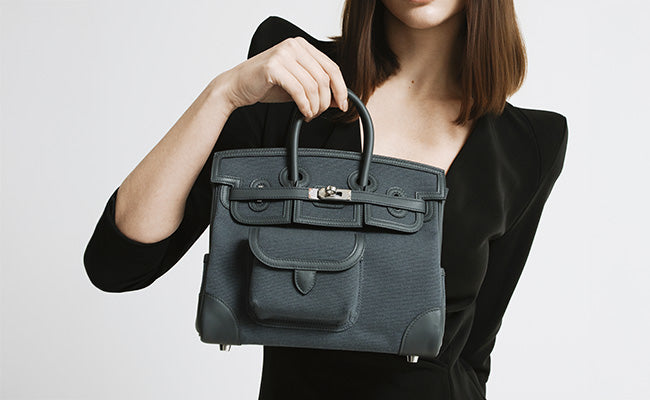
Étoupe makes denim look elevated. Try an Étoupe Birkin with dark jeans and a white shirt, simple, but it just works.
Navy and Hermès neutrals are a match made in style heaven. An Étoupe or Gris Asphalt bag with a navy blazer? Instantly sharp, no effort needed.
Some favourite navy combos:
- Navy trench + Étoupe Kelly = Parisian vibes
- Navy sweater + Gris Tourterelle Constance = subtle luxury
- Navy pants + Craie accessories = crisp contrast
Olive pairs beautifully with warmer neutrals. Olive cargo pants with an Étoupe Garden Party? Feels earthy, but still refined.
Cooler Hermès greys work great with denim too. A Gris Perle Picotin with classic blue jeans nails that French-girl look.
Styling with Capsule Wardrobe Basics
Capsule basics get a serious upgrade with Hermès neutrals. A black turtleneck and trousers? Throw on an Étoupe Constance and suddenly it’s a look.
White shirts are MVPs, every Hermès neutral works with them. Gris Asphalt accessories add depth to an all-white outfit without weighing it down.
Go-to capsule pairings:
- Black blazer + any Hermès grey = ready for business
- Camel coat + Étoupe bag = tonal and chic
- Beige trousers + Gris Tourterelle = elegant monochrome
Neutral knitwear layers beautifully with Hermès bags. Cream cashmere with Craie leather is understated, but so luxe.
The best part? One Étoupe bag transitions from work to weekend without missing a beat.
Incorporating Blush and Soft Accent Colors
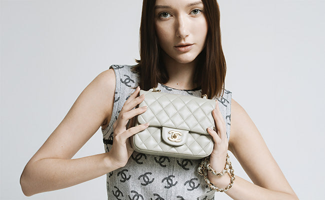
Blush tones with Hermès neutrals, especially Étoupe and Gris Asphalt, feel soft and a little romantic. A dusty rose sweater with an Étoupe Kelly is feminine, not saccharine.
Soft accents keep neutral outfits from feeling flat. Cream or champagne pieces add gentle contrast to deeper Hermès greys.
Some soft color pairings:
- Blush cardigan + Gris Tourterelle bag
- Cream silk blouse + Étoupe accessories
- Camel scarf + any Hermès grey
Rose Gold jewellery really brings these combos together. The warmth ties blush and neutrals in a way that feels effortless.
Powder blue with Hermès greys? Surprisingly fresh. Try a pale blue shirt with Gris Perle accessories, it’s a little unexpected, but so good.
Accessories that Elevate: Hermès Bags and Signature Touches
The right accessories can make a neutral Hermès bag go from beautiful to unforgettable. Thoughtful color choices and a little creativity add interest while keeping things polished and harmonious.
Choosing Accessories by Neutral Shade
Each neutral shade really calls for its own set of accessories. Étoupe looks fantastic with warm metallics, think gold hardware and cognac belts. This taupe-grey neutral pairs well with cream scarves and camel-toned shoes.
Gold Hermès bags stand out alongside rich earth-toned accessories. Try chocolate brown boots, ivory cashmere scarves, or deep burgundy gloves. The warmth of this classic neutral just seems to invite accessories in similar hues.
Noir is the most adaptable of the bunch. It opens the door to pops of color: bright silk scarves, metallic shoes, or bold jewelry. White accessories create a sharp contrast, while jewel tones bring in a sense of drama.
Craie and other pale neutrals need accessories that keep things light and elegant. Pearl earrings, nude shoes, and soft pastel scarves keep the look refined.
Color Blocking for Visual Interest
Color blocking with neutral Hermès bags can create bold visuals without losing any elegance. For example, pair a Gris Asphalt bag with navy and cream for a look that’s both sophisticated and a little playful.
The trick? Pick one main neutral and two accent colors. A Chai bag goes nicely with a deep forest green coat and a crisp white shirt. That way, you get clear, intentional color zones.
We try to avoid muddy mixes by keeping boundaries sharp, structured blazers in one color, trousers in another. It’s all about clean lines and distinct pieces.
Changing up textures helps too. Smooth leather with knit cashmere, or a silk scarf thrown over a wool coat, makes each color block stand out.
Selecting Shoes and Scarves for Harmony
Shoes and scarves really finish the look. We usually match shoe tones to the bag’s hardware instead of the leather. Gold hardware? Pick warm brown or cognac shoes.
Silk scarves are a fun way to add color. Drape one around your neck or tie it to your bag handle. Just make sure the scarf’s undertones work with your neutral bag.
For Biscuit or Nata bags, stick with shoes in similar warm shades, nude pumps, tan loafers, or cream boots. That keeps things harmonious but still interesting.
We also think about where we’re headed. Workdays call for more subtle combos, while weekends are made for playful scarf patterns or unexpected shoe colors. The neutral bag keeps everything grounded.
Advanced Styling: Creative Mixes and Personalized Neutrals
Getting the hang of Hermès neutrals isn’t just about matching colors. It’s about building palettes that feel like you. The real magic comes from mixing neutral tones seamlessly and sprinkling in color accents that don’t overpower your luxury pieces.
Creating Custom Color Palettes
You can build your own palette by picking three or four neutrals with similar undertones. Start with your favourite Hermès neutral, maybe étoupe, craie, or gold.
Warm Palette Example:
- Primary: Gold (Hermès bag)
- Secondary: Camel coat
- Tertiary: Cream blouse
- Accent: Cognac leather shoes
Cool Palette Example:
- Primary: Étain (Hermès bag)
- Secondary: Charcoal wool trousers
- Tertiary: Pearl grey cashmere
- Accent: Black patent loafers
When you stick to your chosen neutrals, everything just fits together.
Lay your pieces out together before buying. Natural light helps you spot undertones and avoid those “oops” moments.
Hermès leathers can vary by year, an étoupe from 2020 might not match one from 2024. It’s worth comparing in person if you can.
Mixing Neutrals for Maximum Impact
Layering different neutrals adds depth without fighting your Hermès piece. The trick is to vary textures and finishes but keep the tones harmonious.
Great Neutral Combos:
- Matte navy blazer + glossy black leather pants + suede cognac boots
- Textured cream knit + smooth camel trousers + patent nude flats
- Wool grey coat + silk ivory blouse + brushed gold accessories
Playing with scale and shape helps too. Mix a structured Hermès bag with flowy fabrics, or match a soft clemence leather with crisp cotton shirts.
Things to Avoid:
- Mixing warm and cool greys together
- Using only one texture (all matte or all shiny)
- Forgetting to mix up the intensity of your neutrals
The 60-30-10 rule is handy: 60% dominant neutral, 30% secondary, 10% accent or metallic.
Adding Pops of Color with Confidence
Color accents can really lift Hermès neutrals if you place them thoughtfully. Start with one accent and build up as you get more comfortable.
Safe Color Additions:
- With Grey Hermès bags: Soft pink, sage green, or dusty blue
- With Brown tones: Burgundy, forest green, or navy
- With Black: Pretty much anything, but jewel tones really pop
Keep your color pop away from your Hermès bag, add it through shoes, scarves, or jewelry, not clothing right next to the bag.
A Few Guidelines:
- Muted colors like dusty rose or sage work with all Hermès neutrals
- Bright colors (coral, electric blue) need a bit more care
- Jewel tones (emerald, sapphire) pair well with darker neutrals
Accessories are the easiest way to experiment. A burgundy scarf or emerald earrings can shake up a neutral outfit, and you can always take them off if it feels too much.
Think about the season, too. Burgundy is perfect for autumn, while lavender feels right for spring.
Frequently Asked Questions
What are the top neutral Hermès colors that go with just about anything in my closet?
Noir is the ultimate chameleon. This classic black works with everything, denim, evening wear, you name it.
Gold adds warmth and sophistication, pairing well with earth tones and jewel colurs. It’s especially gorgeous with navy, cream, and burgundy.
Etoupe is the perfect greige. This taupe-grey shade plays nicely with pastels, bold colors, and other neutrals.
Etain is a cool-toned pewter grey that looks great with blues, purples, and crisp whites.
Craie brings understated elegance in creamy white. It’s versatile year-round and adds polish to any palette.
How can I match my Hermès bag with a vibrant wardrobe without clashing?
Try the 60-30-10 rule - let your Hermès neutral be the 10% accent while your vibrant pieces take the spotlight.
Pick one statement color per outfit and let your neutral Hermès piece balance things out. A Gold Birkin with a bright coral dress? That’s harmony, not competition.
Check the bag’s undertones. Warm neutrals like Gold love warm brights like orange and red; cool neutrals like Etain vibe with blues and greens.
Can you suggest some foolproof Hermès color combos for a chic, understated look?
Etoupe with soft blush is effortlessly sophisticated. Add cream or white for a dreamy, tonal look.
Noir with navy and grey is timeless. This monochrome style feels polished without trying too hard.
Gold with camel and cream is pure luxury. It works for both casual and business looks.
Etain with white and light blue gives you fresh minimalism. Clean, modern, and always chic.
What's the secret to mixing prints with Hermès neutral-toned bags?
Look for prints that include your bag’s neutral. A Gold Kelly with leopard print or paisley that picks up gold tones? Perfect.
Let your neutral bag anchor busy patterns. An Etoupe Constance will calm a bold floral dress or geometric print.
Stick to one main print per outfit. Your Hermès bag should tie everything together, not get lost.
Pay attention to scale. A neutral bag can bridge different print sizes and keep things cohesive.
In the world of Hermès, how do I choose the perfect shade of neutral for my skin tone?
Warm undertones glow with Gold and warmer beiges. These colors flatter golden, peachy, or yellow skin beautifully.
Cool undertones look amazing with Etain, Noir, and cooler greys. These shades complement pink, blue, or red undertones.
Neutral undertones? Lucky you, any Hermès neutral will work. Choose based on your style and wardrobe, not just skin tone.
Test colors against your wrist in natural light. The right shade should make your skin look brighter, not duller.
What style tips can elevate my outfit when accessorizing with an Hermès neutral classic?
Match your metals to your bag's hardware. Gold hardware looks great with warm-toned jewelry, while palladium hardware works best with silver or platinum.
Let your bag's color spark your makeup choices. If you're carrying an Etoupe bag, maybe try taupe eyeshadow or a subtle neutral lip.
Play with texture contrast for some visual interest. Pairing a structured Hermès bag with soft, flowing fabrics can create a nice mix, no need to worry about clashing colors.
Let your bag stand out. When you carry a statement Hermès, keep other accessories simple so everything feels balanced, not overdone.
Written by Rome Station
