

How Collectors Evaluate Stone Uniformity in Van Cleef Pieces
Check out our Van Cleef & Arpels collection!
When you get your hands on a Van Cleef & Arpels piece, stone uniformity is one of those things that instantly sets the exceptional apart from the merely nice. The maison’s reputation really hinges on their almost obsessive attention to matching colour, lustre, thickness, and surface quality in every stone they use.
Collectors check uniformity by looking for colour matching across all elements, surfaces free of obvious flaws, even thickness in flat inlays, and a balanced tone that feels harmonious rather than jarring. This goes whether we’re talking mother-of-pearl, onyx, malachite, or carnelian. Once you know what to look for, the difference between a well-matched piece and a so-so one jumps out, and it can seriously affect both confidence in authenticity and resale value.
Knowing how to spot these details is key if you’re buying, selling, or just want to geek out over the craftsmanship that makes luxury jewelry what it is. Let’s look at the markers experts use when they’re sizing up stone quality and consistency in Van Cleef pieces, including those little things only the trained eye catches.
Key Takeaways
- Stone uniformity in Van Cleef pieces means consistent colour, lustre, thickness, and surface quality across every element
- Each material type has its own quirks, from the shimmer in mother-of-pearl to malachite’s wild veining
- Authenticity and value hinge on understanding both stone quality and the way the stones are set
Evaluating Stone Uniformity in Van Cleef & Arpels
Stone uniformity is what puts authentic Van Cleef & Arpels pieces in a different league from imitators. The maison’s craftsmen match colour, opacity, and visual traits across every motif. Here’s what collectors actually look for when they want to confirm a piece is the real deal, and worth the investment.
What Collectors Look For in Stone Consistency
Authentic VCA pieces use stones from the same batch, so every motif matches in colour and tone. If you’re checking out a five-motif bracelet, each stone should look just like the others, no lighter or darker oddballs.
Key uniformity markers:
- Colour depth - Motifs have the same saturation, no outliers
- Opacity levels - Stones are equally translucent or opaque
- Natural patterns - Materials like malachite or tiger’s eye have grain going in the same direction
- Surface finish - Every stone has the same polish and shine
Van Cleef & Arpels artisans pick chalcedony and similar stones with a careful eye for how the striations line up. They position transparent or translucent areas so the whole piece looks balanced, not patchy. Stones with optical quirks are mapped out before cutting to keep the harmony.
The certificate of authenticity will list the materials, but a hands-on inspection is what really tells you if the stones came from the same process. Genuine pieces show the patience and precision you expect from high-end jewelry.
Why Stone Matching Defines Luxury Value
Stone uniformity isn’t just a technical thing, it’s a big deal for resale and collector demand. We’ve seen authenticated Alhambra pieces with flawless stones sell in a flash, while ones with mismatched motifs just sit there.
Van Cleef & Arpels only uses top-notch gemstones. Diamonds are D to F in colour, FL to VVS2 in clarity. This strictness applies to everything, from mother-of-pearl to carnelian. When collectors check condition, they’re really asking if every stone still meets those standards.
If you spot mixed batches, you’re probably looking at replacement stones or repairs that didn’t happen in a Van Cleef atelier. Even tiny differences in undertone can knock 20-40% off a piece’s value. Serious collectors always compare stones under the same lighting and from different angles, since photos can hide a lot.
If you’re after investment-grade, you want documentation showing the stones are original. That provenance keeps your piece’s value safe and ensures it still lives up to VCA’s standards.
Red Flags: Signs of Non-Original Stones
Replacement stones almost never line up with Van Cleef & Arpels’ exact specs. You can spot non-original materials by looking for colour shifts between motifs, weird cutting angles, or gaps around the settings where the fit isn’t quite right.
Warning signs of replacement stones:
| Issue | What to Check |
|---|---|
| Colour mismatch | Compare undertones in natural light |
| Poor fit | Look for gaps or loose settings |
| Surface inconsistency | Check polish quality across all motifs |
| Pattern misalignment | Verify grain direction in striated stones |
Chalcedony pieces should have transparent and opaque areas placed with intention, not just slapped together. If the positioning looks random, the stones probably weren’t cut using VCA’s process. Mother-of-pearl motifs need matching iridescence and lustre, since the maison sources them from specific mollusks.
Seasoned valuers can usually spot stones that don’t measure up to the house’s standards. If diamonds have visible inclusions or fall below VVS2, the piece was either altered or never made by Van Cleef & Arpels. Honestly, if you’re buying pre-owned and the seller can’t show original paperwork, get a pro to authenticate it.
Core Criteria for Stone Selection and Matching
Van Cleef & Arpels doesn’t mess around when it comes to stone selection. They check for colour saturation, clarity, and cutting precision so every stone fits their strict criteria. These things all work together to create that harmony collectors crave.
Colour Saturation and Uniformity
Van Cleef & Arpels diamonds have to be D, E, or F on the GIA scale. Centre stones? Only D or E. That means you’ll never see a yellow or brown undertone. The difference between grades can be subtle, but under certain lights, lower grades start to look a bit warm, and that’s not what VCA wants.
For coloured and ornamental stones, it’s all about saturation and tone. Malachite needs bold, clean banding that runs smoothly, no dead spots or weird colour jumps. Mother-of-pearl should have even lustre with enough nacre depth to look dimensional, not flat.
When matching stones in one piece, uniformity beats individual stone quality. A five-motif Alhambra with perfectly matched malachite means the maison sifted through tons of stones to find five that clicked. If you see mismatched saturation or pattern density, you’re probably looking at a fake or a compromised original.
Clarity, Lustre, and Polish Standards
Diamonds must be FL (Flawless) to VVS2 (Very Very Slightly Included), that’s basically no inclusions, even under 10x magnification. Where the inclusion sits matters too: near the table, it’s worse than one tucked by the girdle.
Polish is huge. Van Cleef & Arpels demands an excellent polish so the stones shimmer the way they’re supposed to. Under magnification, you want to see clean surfaces, no scratches, no buffing marks.
Lustre is especially important for stones like onyx and mother-of-pearl. Real onyx has a glassy, even sheen and is totally opaque. Mother-of-pearl should have a silky, shifting glow. If you spot surface defects, pitting, or dull spots, that’s a red flag for fake materials or just poor selection.
Cut Precision and Proportions
Van Cleef & Arpels only takes “excellent” or “very good” diamond cuts, nothing less. Cut affects how light bounces inside the stone, so proportions have to be spot-on. Bad cuts leak light and kill the sparkle, even if the colour and clarity are great.
Collectors check crown height, pavilion depth, and table percentage to confirm the cut is right. Facet symmetry should be tight, with edges lining up and meeting at clean angles. Even girdle thickness matters, it affects both durability and how the stone sits in its setting.
Ornamental stones like malachite or onyx get cabochon cuts, not facets. Those domes should be smooth and even, no flat spots or lopsided curves. Softer stones need a gentler touch during cutting, or they’ll chip and lose that high-end look.
Iconic Stone Types and Their Unique Markers
Every stone type Van Cleef uses has its own personality, distinctive visual cues that help you tell what’s real and what’s not. Knowing these little markers, from lustre quirks to colour patterns, is the foundation for evaluating quality.
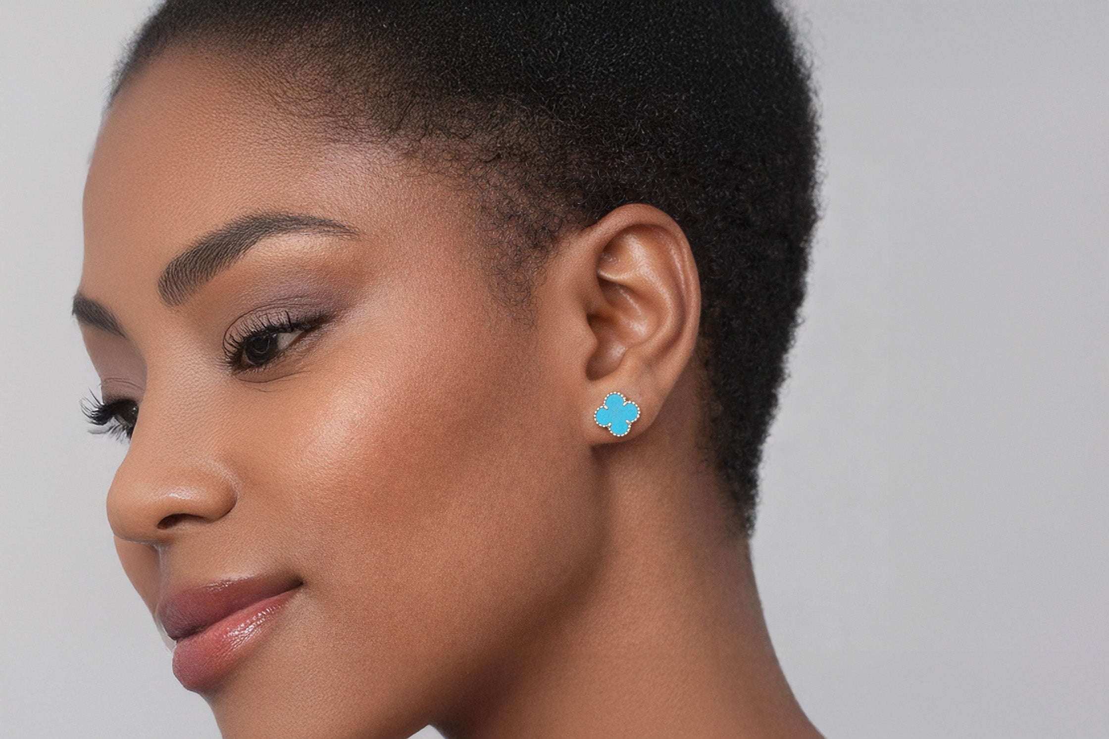
Mother of Pearl and Its Signature Glow
Mother of pearl gets its shimmer from aragonite platelets layered inside the shell. When you check out genuine Van Cleef mother of pearl, look for even nacre thickness and a smooth surface that bounces light evenly.
The ideal is that “orient”, a rainbow shimmer that shifts as you move the piece. It should look organic, not fake or too perfect. Real mother of pearl also shows faint growth lines and colour shifts, which prove it’s natural.
Watch how the material plays with light. Quality mother of pearl in Van Cleef pieces glows softly, not with harsh reflections. There’s a sense of depth, like the light is coming from within, not just off the surface. Touch matters too, authentic pieces feel silky, not plasticky.
Identifying Authentic Malachite Banding
Malachite’s green bands are both its charm and its ID card. No two stones are identical, so you have to check if the banding looks naturally geological, not painted on.
Check how the bands flow. Natural malachite shows circles, swirls, and uneven patterns that follow the stone’s growth. The bands vary in width and shade, deep greens to minty tones. If the pattern looks too sharp or regular, it’s probably synthetic.
The surface should have a consistent polish, no fillers or coatings that hide the real pattern. When you look at malachite, see if the banding continues smoothly across edges and bezels. Genuine stones have patterns that make sense geologically, not ones that stop or restart for no reason.
Onyx, Carnelian, and Other Semi-Precious Gems
Onyx in Van Cleef pieces should be a deep, even black with no banding or inclusions. The opacity should be total, hold it up to the light and it shouldn’t glow at the edges.
Carnelian varies more, from pale peach to deep orange. The good stuff almost glows from within. The best pieces have subtle gradations that add depth without ruining uniformity. Some cloudiness or translucency is actually a good sign, it shows it’s natural.
Agate and chalcedony need a different eye. Agate’s bands should be natural and flowy, not abrupt. Chalcedony is more uniform but has a soft, waxy sheen. Tiger eye is all about that moving band of light, chatoyancy, which tells you it’s been cut right. Lapis lazuli and turquoise sometimes show up in Van Cleef, but not as often as the others.
Stone Setting Techniques and Craftsmanship
Van Cleef & Arpels is famous for setting stones in ways that keep everything visually seamless. The precision of pavé work, the trickiness of the mystery set, and the way they finish the edges all reveal authenticity if you know what to look for.
Pavé Setting vs Mystery Set Explained
Pavé settings mean tiny diamonds sit close together, held by little beads or prongs so the sparkle looks unbroken. Each stone sits in its own hole, and the metal is pushed over the girdle to lock it in. You want to see even spacing, matching bead heights, and stones that are all the same size.
The mystery set is a Van Cleef signature, no metal is visible between stones. Each gem has grooves cut into its pavilion that slide onto hidden rails. The effect is stones floating together, no gaps or metal showing.
Real mystery-set pieces have stones that line up perfectly, with no spaces or metal peeking through. This technique needs stones cut to insanely tight specs. Fakes usually mess up the spacing or let the metal show, since pulling off a true mystery set takes real skill and custom gems.
Milgrain, Bezel, and Signature Edges
Milgrain is that beaded edge you see framing a lot of Van Cleef settings. Authentic milgrain has even beads, made by rolling a knurling tool along the edge. Each bead should catch light the same way, no flat spots or weird gaps.
Bezels wrap stones in a thin metal rim, holding them tight and protecting the edges. Van Cleef bezels fit flush, no gaps or extra metal. The Alhambra collection uses bezels a lot, with the gold sitting perfectly around each clover petal.
Check that bezel edges are smooth and rounded, not sharp or rough. The transition from metal to stone should feel seamless. Van Cleef’s signature edges often mix polished and brushed finishes, giving contrast that makes the stones pop without stealing the show.
Spotting Hand Finishing and Tool Marks
Authentic Van Cleef pieces show hand finishing where machines just can't reach. We check the undersides of settings and those tight spots between prongs with magnification, searching for subtle tool marks, tiny clues that someone actually worked on the piece, not just a factory robot.
You'll notice hand-finished pieces have little surface variations. These marks aren't random scratches, they're deliberate, showing a steady hand and real skill. Around the stone settings, the metal should have smooth transitions, but not so much polishing that the crisp edges get lost.
The backs of mystery-set pieces? That's where the real story is. Those rails need to run perfectly parallel, solder joins should basically disappear. We like to see the same careful finishing on the hidden parts as on the showy bits, classic Van Cleef, always fussing over every detail.
Stone Uniformity Across Collections and Motifs
Van Cleef & Arpels doesn't use one-size-fits-all rules for stone uniformity. It depends on the collection and even when the piece was made. The Alhambra motif, for example, demands perfectly matched petals, while Perlée and Frivole collections have their own standards.
Alhambra Motif: Matching Petals and Stones
Every four-leaf clover in the Alhambra line needs stones with matching colour and pattern in all four petals. When we look at malachite pieces, the banding should flow naturally, no weird colour jumps or empty spots. Pattern orientation counts, too. Authentic pieces have carefully cut stones so the bands look harmonious.
Mother-of-pearl Alhambra pieces should show the same lustre in every petal. The nacre ought to have some depth, not a flat or chalky look. We want that iridescence to catch the light the same way everywhere.
Onyx versions must use true black stones, no grey streaks, no brownish shadows anywhere. Carnelian and tiger's eye pieces need that chatoyancy centred in each petal, not chopped off at the edges. For turquoise Alhambra, the matrix patterns should work with the blue-green base, and all motifs in one piece should look consistent.
Vintage vs Modern Alhambra Quality
Vintage Alhambra from the '70s and '80s sometimes shows slight mismatches in stone banding or colour. We've seen older malachite necklaces where the petals aren't quite identical, though the materials are still top-notch.
Modern Alhambra? Much stricter. Stones match more closely, and the cutting is more precise. The gold beading around each motif is more uniform now, with exact spacing and height.
Sweet Alhambra and Magic Alhambra stick to the same matching rules, just at different sizes. The smaller Sweet Alhambra motifs actually demand even tighter stone work, any little flaw stands out more when things are tiny.
Uniformity in Perlée, Frivole, and Magic Alhambra
Perlée focuses on diamond placement, not coloured stones. Diamonds are spaced evenly, all matching in colour (D-F range) and clarity (FL to VVS2). Those gold beads around the diamonds should be identical in size and shine.
Frivole pieces have bigger diamond or mother-of-pearl petals in flower shapes. Every petal in a Frivole piece should match in quality and finish. Between-the-finger rings are especially tricky, they need perfect symmetry since the petals are right in your line of sight.
Magic Alhambra pieces are bigger, so they need stones cut from the best parts of the material to keep the pattern consistent across the larger area. For instance, a Magic Alhambra pendant needs malachite with bold, uninterrupted bands or mother-of-pearl with flawless nacre, all the way across.
Authentication Markers Beyond Stones
Van Cleef & Arpels is serious about their hallmarking system. These marks give you authentication evidence that doesn't rely on the stones themselves. Original packaging and paperwork add another layer that collectors rely on.
Hallmarks, Stamps, and Serial Numbers
Every real Van Cleef & Arpels piece has specific marks in a set format. You'll see "Van Cleef & Arpels" or "VCA", never just "Van Cleef," which is a red flag. They only use 18-karat gold, marked 750, and platinum pieces get a Pt950 stamp.
Hallmarks are placed strategically. For Alhambra necklaces and bracelets, look for the VCA stamp on a tag near the clasp or on the motif next to it. The serial number usually shows up on the clasp, along with the metal purity mark.
Earrings split the markings between the two clips, one might have the trademark, the other the serial, or sometimes both on one side. Rings show hallmarks on the outside of the shank, near the bottom, though these can wear down over time.
It's not just about having the marks, they need to be sharp and clear. Van Cleef & Arpels doesn't do fuzzy, shallow, or sloppy stamps. If you see that, be suspicious.
Packaging and Accompanying Documentation
Van Cleef & Arpels packaging is tough for fakers to copy. Real pieces come in high-quality boxes, with specific colours, textures, and interiors the brand has tweaked over decades. The boxes themselves are a bit of a work of art.
Every new piece comes with a certificate of authenticity listing the serial number, materials, and purchase info. These certificates use specific paper and security features that change over the years, but the quality stays high.
Vintage pieces sometimes don't have their original packaging or certificates. That doesn't mean they're fake, but when the paperwork is there, it's a big plus. The serial number on the certificate must match the one on the jewellery, if not, that's a problem.
Market Value, Provenance, and Collector Psychology
Stone uniformity can make or break what collectors are willing to pay, whether at auction or in private. Documented provenance from the Van Cleef & Arpels archives adds a premium, especially for pieces with perfectly matched stones.
How Stone Uniformity Impacts Resale
If the stones don't match, the market notices. We see vintage Van Cleef pieces with mismatched sapphires or uneven turquoise usually selling for 20-30% less than examples with uniform stones.
In fine jewellery, stone uniformity is non-negotiable. If you're buying a vintage Alhambra necklace, you expect every motif to match in colour and clarity. One odd stone throws off the whole look and makes people wonder if it's been repaired or altered.
Resale matters:
- Original stones fetch more than period-correct replacements
- Total colour matching is key for multi-strand pieces
- Uniform finish suggests good care
- Stone size needs to be consistent, especially in bracelets and necklaces
Collectors who buy for investment pay close attention to these details, they know future buyers will, too.
Prestige Factors: Provenance and High Jewellery
Provenance can totally change how collectors see stone uniformity. Documentation from Van Cleef & Arpels, especially for high jewellery with custom stones, adds real value.
Major auction houses put a lot of weight on provenance. A solid ownership history eases worries about stone replacements and backs up the uniformity you see. This gets really important for rare pieces where you can't just eyeball the original specs.
Collectors get attached to pieces with a story. Perfect stone uniformity isn't just about looks, it's proof of the maison's original vision, not some later fix.
What Auction Houses Look For
Auction specialists use set protocols to check stone uniformity, blending gemology with brand-specific knowledge. For Van Cleef & Arpels, they compare stones against known standards from the right era.
Auction checklist:
- Colour matches under different lights
- Inclusion patterns line up in natural stones
- Cutting style is consistent
- Mounting depth is uniform and secure
- Surface wear fits with original stones
Major auction houses keep databases of past Van Cleef sales, so they can compare your piece to others. They flag uniformity issues in their reports, savvy collectors use this info to adjust bids. When two or more collectors really want a piece with flawless stones, prices can shoot past the estimate.
Frequently Asked Questions
Experts use magnification, colour grading, and material testing to check stone consistency. They also lean on setting quality and historical sourcing, details that matter to serious collectors.
What techniques do experts use to assess the consistency of gemstones in Van Cleef & Arpels jewelry?
We always start with 10x magnification. That lets us catch surface flaws, polish issues, and inclusions you can't see with the naked eye.
For colour, we line up the stones under controlled lighting, daylight bulbs work best, since they don't mess with colour perception. We're looking for even intensity across all stones, especially in multi-motif pieces like Alhambra bracelets.
Pattern matters, too. Malachite banding should flow from one motif to the next, and mother-of-pearl needs even depth and shine. Tiger's eye chatoyancy should sit right in the centre, and onyx should stay jet black, no streaks.
We use gemological tools like refractometers and specific gravity tests to confirm the materials. Those tell us if we're looking at real turquoise or a treated copy, genuine carnelian or dyed agate.
How do variations in stone cut affect the value of Van Cleef & Arpels pieces when evaluating for purchase?
Cut quality really matters for how a stone plays with light. Van Cleef & Arpels only uses excellent or very good cuts for diamonds. If a stone leaks light instead of reflecting it, that's a problem.
We check the proportions, crown, pavilion, table, to see if they meet VCA's standards. The depth-to-width ratio should make the stone look big without losing sparkle or strength. Facets need to line up; if they don't, you get dead spots where the light just fizzles.
Polish matters, too. Under magnification, we look for polish lines. Even tiny surface flaws can dull the sparkle, especially in pavé settings with lots of small diamonds.
If the cuts are off, the value drops, sometimes by 30 to 50 percent. Van Cleef's reputation is built on consistency, so cut issues usually mean a replacement stone or something fishy.
Could you shed light on how the clarity and colour uniformity of stones influence the appraisal of Van Cleef collections?
Van Cleef & Arpels only accepts diamonds with clarity grades from FL through VVS2. That means inclusions are non-existent or super hard to spot at 10x magnification. We pass on pieces with VS1 or lower clarity, they're likely replacements or not authentic.
Colour uniformity is just as strict. Centre stones should be D or E, and side stones can go to F. Any hint of yellow or brown is a warning sign, VCA doesn't settle for less.
For coloured stones, we look at saturation, tone, and how the colour spreads. Turquoise needs to be an even blue-green, and malachite should have bands with the same intensity everywhere. If the colour is patchy, it's not up to VCA standards.
Mixed clarity or colour in one piece often means stones were swapped after damage. We make note of this, since it can knock thousands off the value.
What are the key indicators of stone provenance that impact the collectability of Van Cleef & Arpels jewelry items?
Original stones from Van Cleef & Arpels come with documentation from their quality control. We check if the materials make sense for the era, certain turquoise treatments weren't around in the '70s, so seeing them in a vintage piece is a red flag.
Materials changed over time. Early Alhambra from the '60s used specific malachite sources with unique banding. Knowing this helps us spot replacements.
Where the stone comes from can matter. Persian turquoise, for example, is worth more than Chinese because of its colour and history. We use gemological tests to check for origin markers, though it's not always cut and dry.
The best proof is paperwork from Van Cleef & Arpels, original receipts, service records, and authenticity cards with matching serial numbers show the stones haven't been swapped. If the documentation's missing, it doesn't prove replacements, but it makes the history a lot fuzzier.
In what ways does the setting of stones play into the overall assessment of Van Cleef & Arpels jewelry pieces?
Setting precision really matters, it keeps stones secure and lets them catch the light just right. I always check how snugly the stones sit in their bezels; even the tiniest gap between the edge and the gold can hint at sloppy work or maybe even a replaced stone. It’s surprisingly easy to spot once you know what to look for.
That signature gold beading around Alhambra motifs? It’s got to be uniform. Each bead should be the same height and spaced evenly, no weird lumps or awkward gaps. Since these beads are hand-finished, you can sometimes spot irregularities that make you wonder if someone repaired or copied the piece. I like to measure bead diameter and just eyeball the spacing around each motif. If it looks off, that’s a red flag.
Prong settings on diamond pieces have their own rules. The metal should grip the stone’s girdle at a specific angle, and the polish needs to be flawless, no stress marks or gaps. I usually press each stone gently; on genuine VCA, those stones don’t budge at all.
Pavé work is where craftsmanship really shows. Each tiny diamond needs to sit at the same height, with equal space between them. The metal in between should have matching grain work, and a smooth finish from proper burnishing. If you run your finger over it, authentic pieces just feel right, no rough patches or unevenness.
How does the historical significance of stone sourcing relate to the evaluation process for Van Cleef & Arpels masterpieces?
Van Cleef & Arpels built close ties with certain gem suppliers over the years. If you know which turquoise mines or malachite sources the maison liked in each era, you’re in a better spot to spot genuine period pieces.
The stretch from the 1950s to the 1970s really stands out for VCA’s wild creativity and gem selection. Lots of estate pieces from that time show off stones with traits that match what we see in museum collections or old auction catalogues. Comparing those material quirks helps us get a sense of what’s real.
Gem supplies changed as time rolled on. Some malachite deposits with those wild, distinctive bands ran out by the 1980s. So, if you find those patterns in a piece, it’s a decent clue about when it was made. Diamond cutting also evolved, older pieces just have faceting that feels right for their time.